Analysed data and formed insights from funnel and event analysis.
Insight
Data-driven design decisions to redesign Earn's homepage.
UI Design
UX Design
Data Analysis
Data Analysis
User Flows
UX Design
UI Design
Choo Yuan Jie · Product Designer
Holly Hsiao · Lead Product Designer
Results
Analysed data and formed insights from funnel and event analysis.
Insight
Re-designed UI for mobile homepage.
Design
Hypothesised 3 different ways to improve conversion rate.
Process
Background
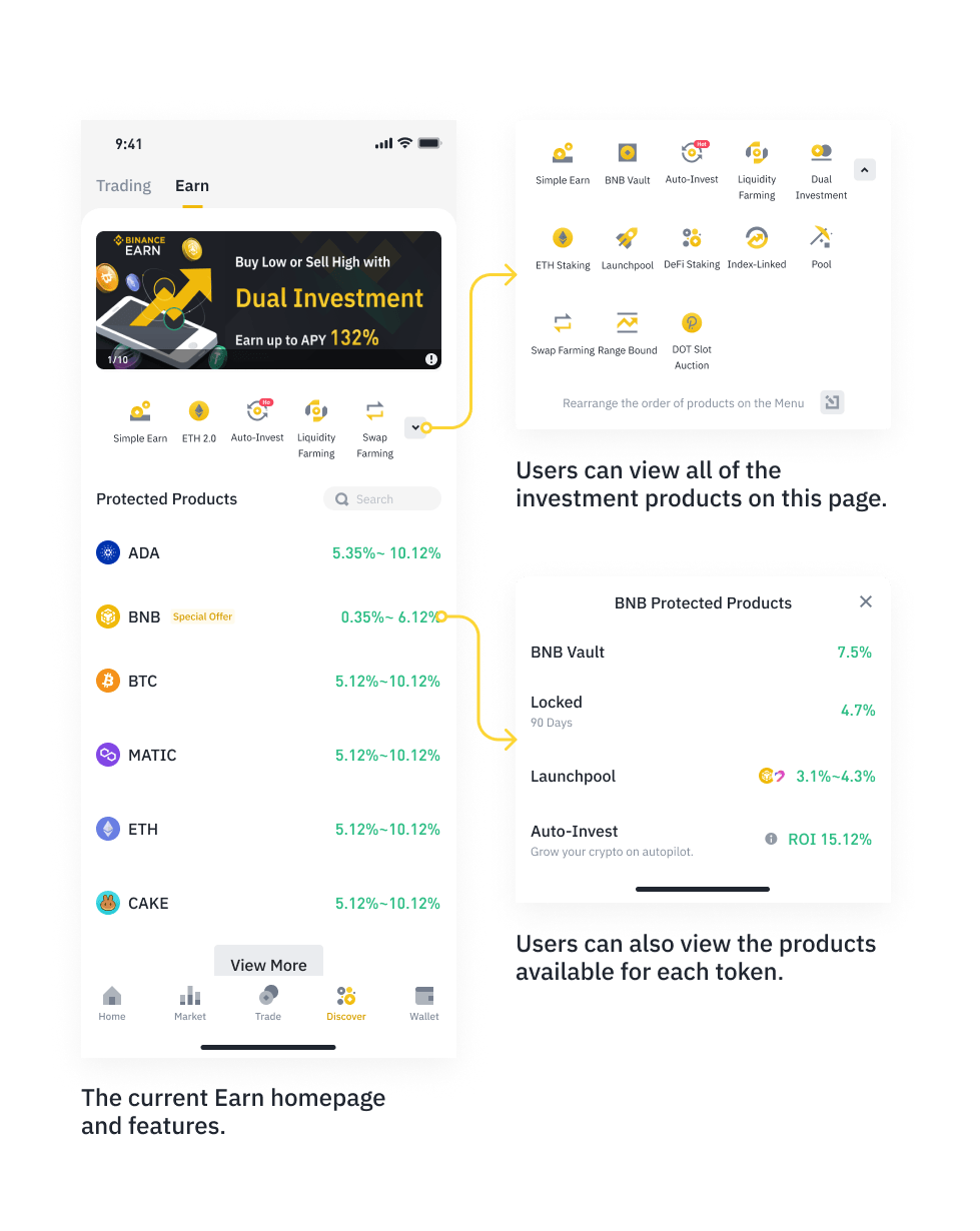
The homepage is the first touchpoint for users to convert into subscribers. It houses more than 10 products with varying risk levels.
Summary
1
Learnt more about user personas of Binance Earn. Uncovered user stories and understood how users made decisions.
2
Analysed current Binance Earn's user flow using Funnel and Event Analysis. Synthesised data into insights and hypotheses.
3
Using the user stories and data insights, formed 3 UI design proposals.
4
Tested it with real users through A/B testing.
Understanding Binance Earn's Users — Personas
Binance's Users can be split into three types, the Earn Beginner, Earn Adventurer Pros and Earn Conservative Pros. To understand how these users would use Binance Earn, I crafted stories based on how they would make decisions — and how each type needs to be recommended to differently.
These insights were gathered from prior research, and also a CSAT survey that I got to help out with!
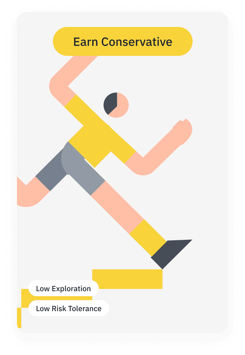
Earn Conservative Pros
I frequently visit the earn page to check and manage my existing positions.
I am more likely to visit products directly from my wallet instead, because I frequently subscribe to the same products.
Basically, I would like to maintain my current portfolio.
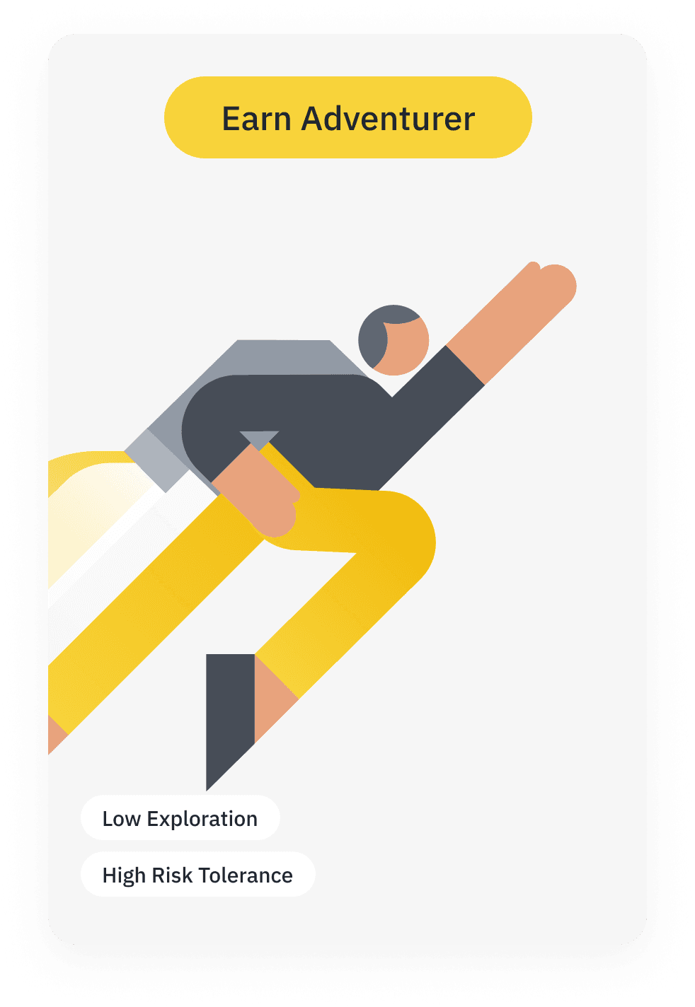
Earn Adventurer Pros
I frequently visit the earn page to check and manage my existing positions.
I am more likely to visit products directly from my wallet as I usually resubscribe to the same products.
I might do some risky investments, only to learn how things work with a small amount first.
Basically, I want to find optimal products and learn more about the functions of each product, before I commit.
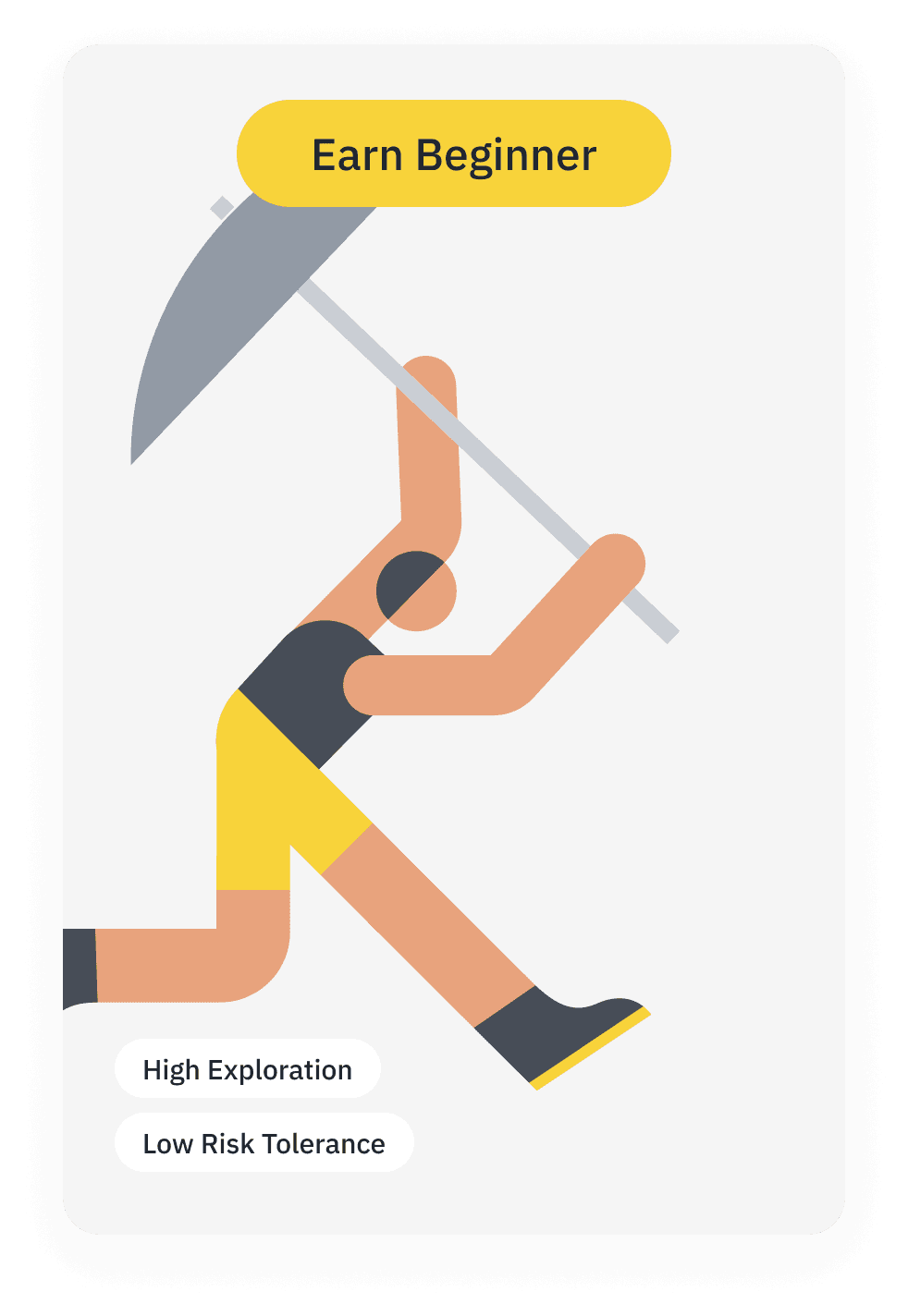
Earn Beginners
I am new to the simple earn page. I am unsure of what I want to do with my coins yet so I don’t mind “window shopping”.
To help with my exploration, I would want to see my holdings then the available services, rather than having to search manually for what’s available.
I don’t opt for high yield and high risk products because I prefer something with stability.
Basically, I want to learn more about the products, but earn safely.
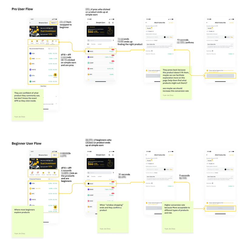
Data Analysis
To understand the current conversion rate, I tapped into the “Funnel Analysis” and “Event Analysis” for the current user flows. This helped me understand a rough idea of what users are doing on the user flow, without conducting usability testing.
The analysis was done on Sensors (an app that queries data). Actual figures are censored due to privacy concerns.
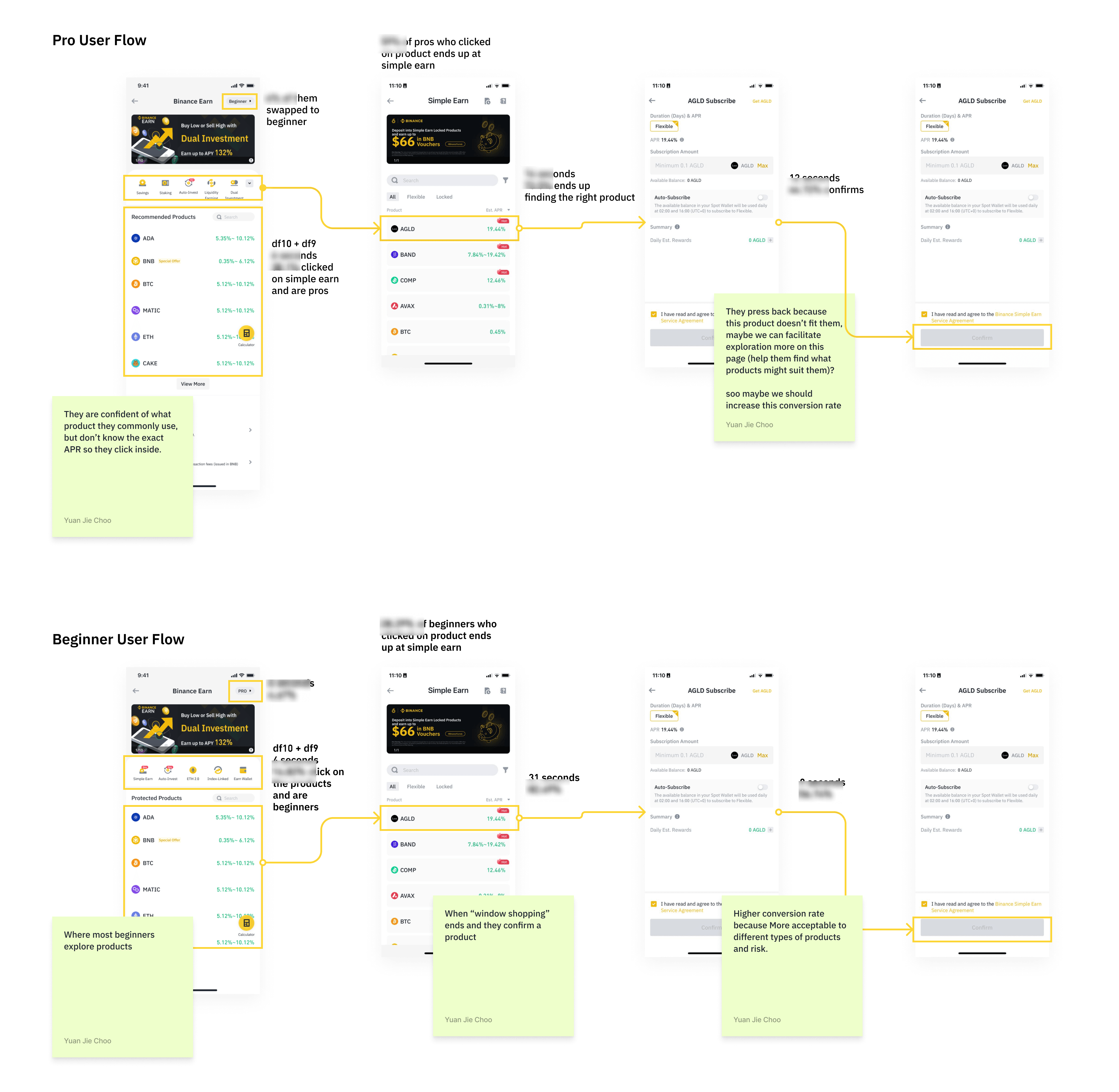
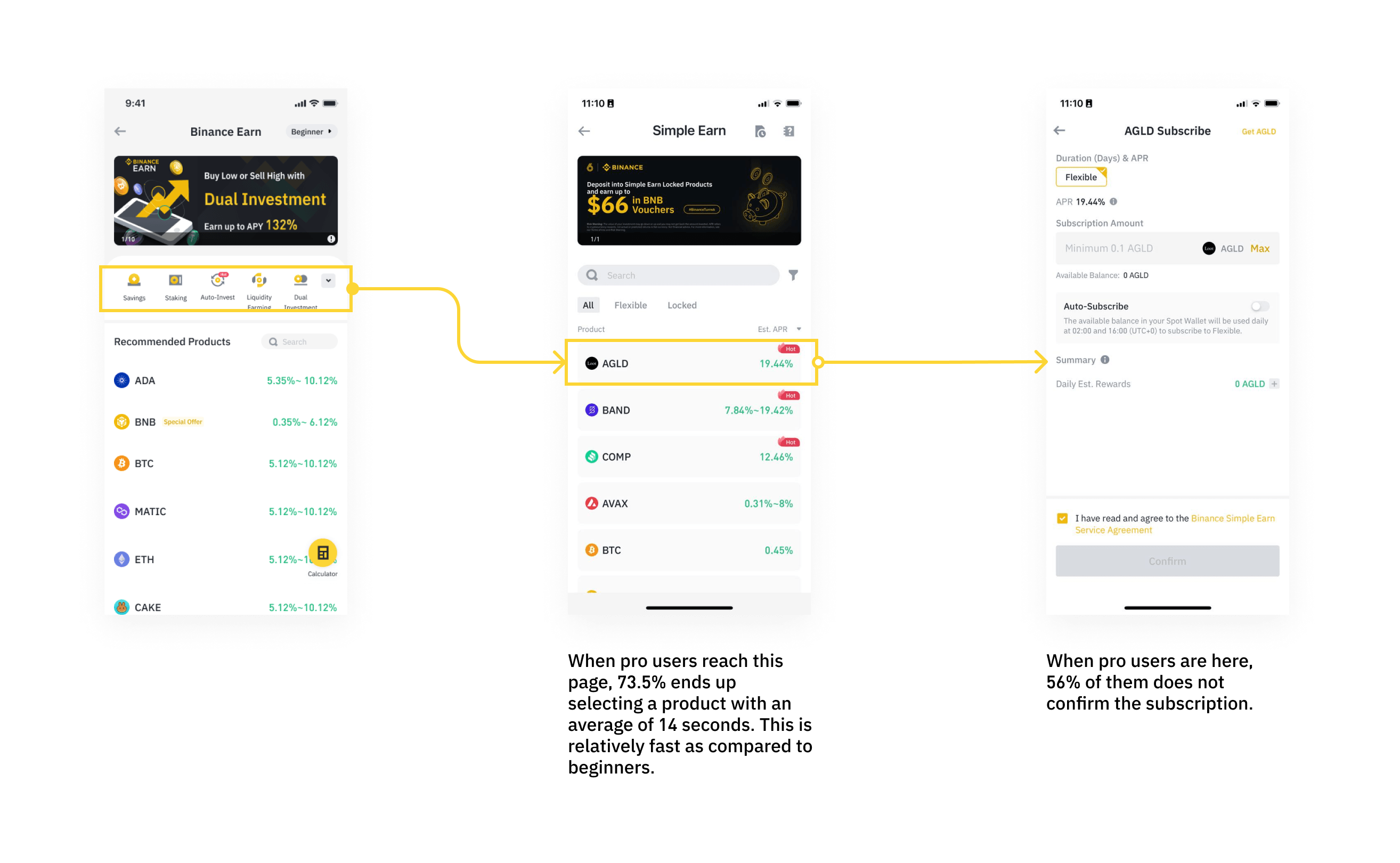
Insight 1 — Earn Pro User Flow
In the Pro user flow, I noticed that more than half of the Pro users confidently click onto Simple Earn thinking that the product is suitable for them. However, 56% of users end up not confirming after learning more about the product.
From the data and persona, it might be because…
Hypothesis 1
Proposal 1
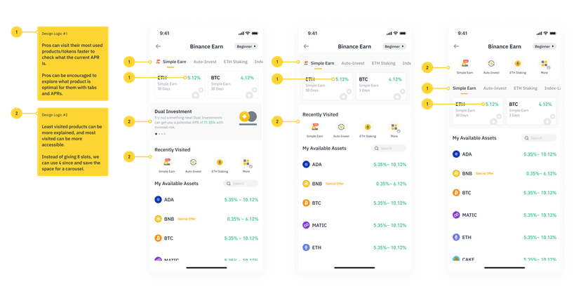
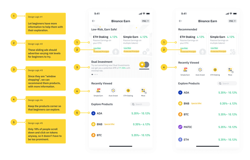
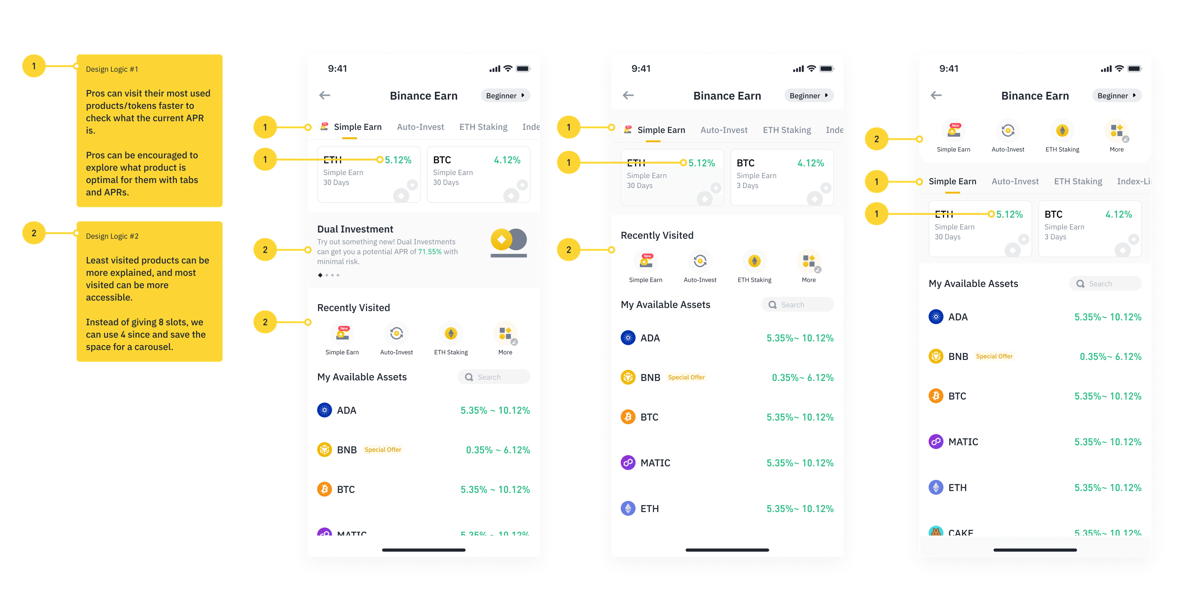
Let Earn Pros get information faster, we can include more practical information about all products in the homepage.
Hypothesis 2
Proposal 2
To encourage Earn Pros to be more exploratory, we can refer and educate products in the homepage that are seldom used by those Pros.
Insight 2 — Beginner User Flow
In the Beginner user flow, I noticed that beginners spend 17 more seconds trying to understand a product before confirming. This might be because of the “window shopping” behaviour discussed previously, not knowing which token to stake.
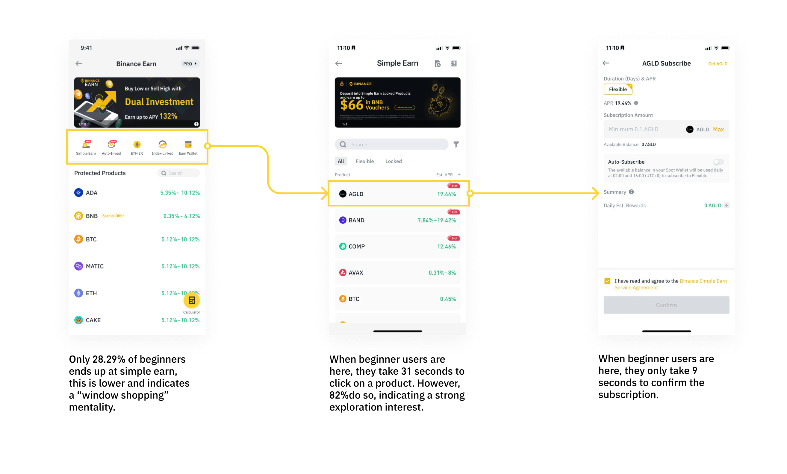
From the data and persona, it might be because…
Hypothesis 3
Proposal 3
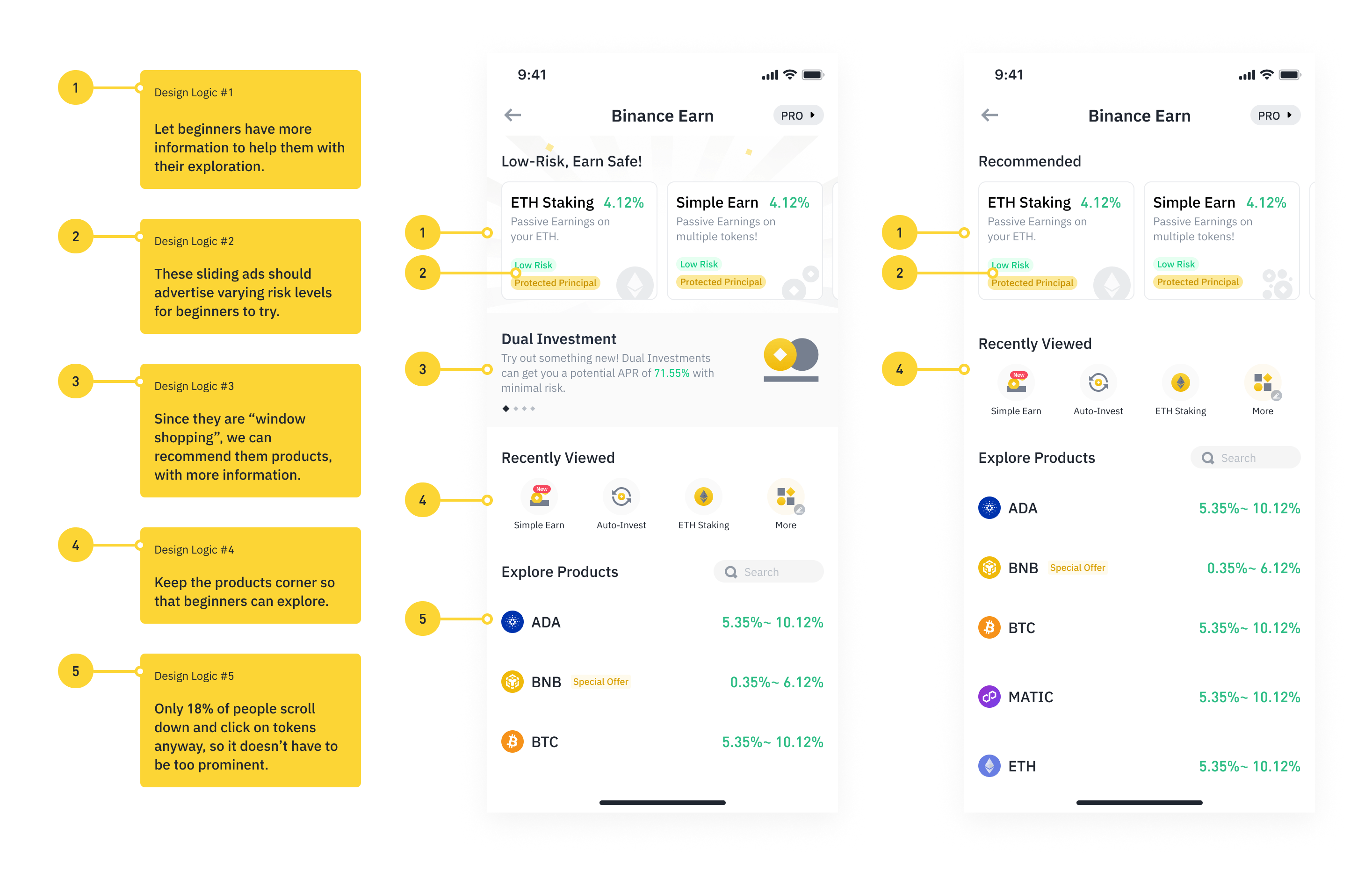
To make Earn Beginners more comfortable with trying products, we can start with products they’ve used before. Over the long term, this might increase the conversion rate, as well as their risk appetite. Other than that, we can also categorise products by risk associated and give them more information to compare on the homepage.
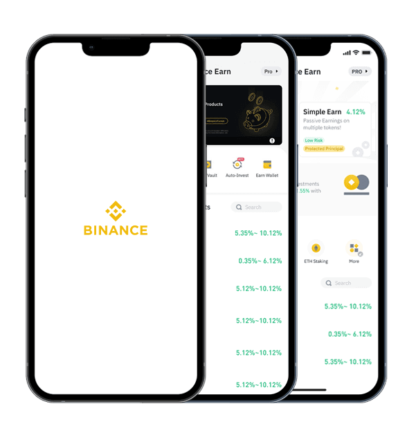
UI Design
“See what you can do with all product with your coins, directly on the homepage”
“Educate pros about less used products”
“Recommend products used before, and by risk level for beginners”
FAQ
I also revisited the FAQ pages, so that users — especially beginners — can learn what a product does before committing to it. Giving people the information to make an informed choice is part of recommending financial products responsibly.
Placeholder image
Lessons from this short project
Sometimes, it is important to leverage on our own experience as evidence to move a design forward fast. When our experiences are used together with data, we can quickly come up with intuitive suggestions that can be tested afterwards.
For a category as sensitive as financial products, that intuition was always pointed at the same goal — recommending the right product to the right user, responsibly.